Your brand’s design can be simple if you know what you’re doing. Let’s examine the points you need to consider when it comes to branding. Being a small business owner doesn’t mean creating your brand’s first-rate identity is impossible. You could put a logo on your product or storefront, but that doesn’t mean customers will be loyal to you.
If you want to create an authentic brand that customers can get attracted to, you need to work hard to create a recognizable and consistent identity. If you don’t have a catchy brand identity, customers will likely leave as soon as they find a cheaper, better, or newer option.
Brand identity is crucial for any business. It sets your company apart from the competition and ensures that people remember your business long after they’ve made a purchase. Your brand’s identity is more than just your logo. It’s the overall feel and the message you want to convey through the essence of your brand, and one of the most critical aspects of nailing down your brand identity is choosing the right typography.
Typography
 It’s important to be consistent with the fonts you use when creating a brand identity. With new fonts developing almost daily, you can choose which font is a better fit and will undoubtedly describe your brand.
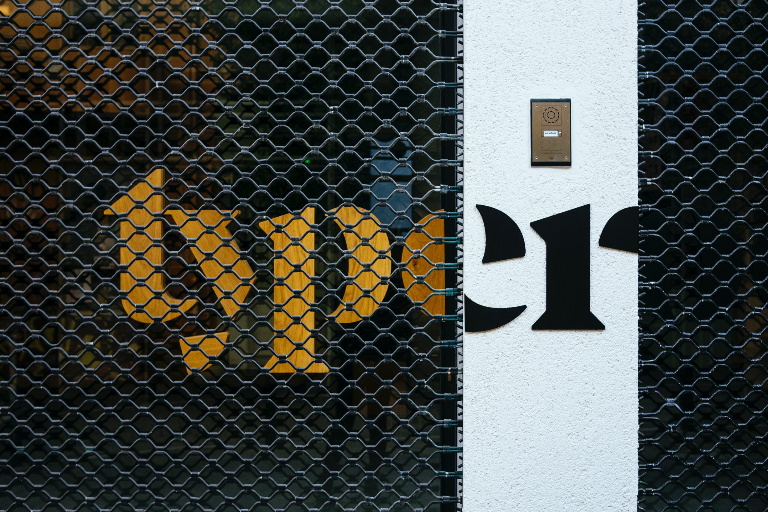
This can be tricky, but choosing a font to showcase your brand identity is important. The typeface you select for your designs can deliver a positive message about your brand. If you’re looking for something that will be used for your brand’s logo or in your brand guidelines, choosing a versatile typeface that represents your core values is important.
While an elegant script font might make a bank’s branding more unique, it might not be the best way to show trustworthiness and professionalism. When it comes to font families, there are a few that stand out above the rest.
Here are the ones you should always set as your priority:
- Serif fonts have been around since the dawn of time.
- Fonts sans serif are often thought of as having a more simplistic, professional look to them. This is one of the reasons why they are used more in business-oriented contexts. However, many modern variations of this typeface break from this norm.
- Script fonts are designed to look like human handwriting. This gives designs a more approachable, elegant, or even humanistic quality.
Graphics And Shape

It’s common when starting to work on the look of your brand to not have everything figured out in terms of how all of your marketing and promotional assets will look. You can save yourself some stress by thinking about the general direction you want to go in and picking a couple of crucial features that you want to be consistent across all assets. From there, you change and make adjustments as per your needs.
And you wouldn’t be entirely wrong; however, it is necessary to create a base or at least decide on a style for all future branding projects. That will help keep everything consistent and looking sharp as your company grows.
Guidelines for success in product management can be challenging to come by. Undoubtedly, people from the industry would agree that you can go the extra mile if you remain consistent. That means that once you decide whether you will use primarily round or square shapes or incorporate colour photos instead of a black-and-white palette, you can develop your branding design further.
Following these guidelines will help ensure that both consumers will respond well to your product.
There are lots of different types of visual assets you can use to make your project more engaging, like illustrations. They can help break down complex processes in infographics or make your website more fun to use with cute motion designs.
Remember that there are many different illustration styles, so you should pick the right one that fits your project’s overall look and feel. For example, minimalistic or isometric illustrations would probably not work well with a retro watercolour design.
Now that you have a solid understanding of branding and how it can help your business, it’s time to look at some of the most critical branding assets you’ll need to have designed. These include things like your logo, your colour scheme, your brand voice, and more. By creating these key elements, you’ll be well on your way to establishing a strong, recognizable brand that will help you attract new customers and grow your business.
Logo Design
 A well-designed logo can positively impact your brand’s image, but it’s just one part of the bigger picture. Your business’s branding is important, and your logo is one part of that. Your logo should be cohesive and consistent with the rest of your branding, so don’t try to cut corners by DIY-ing it.
A logo that doesn’t accurately represent your business can do some serious damage in the long term. You might have to spend a lot of money to change it, which will include rebranding and coming up with an entirely new logo that better suits your brand identity. To avoid this, work with professionals and be original from the get-go.
Your logo design should say more than a picture can. It needs to be able to speak to your potential customers and clients and let them know what they can expect from your business. If you’re not sure who your target market is, think about what kinds of designs they would respond well to. You also don’t want to go for something that’s only trendy because it will quickly become dated.


